Emily Ryan: Type Definitions: Q - S
Quad.
In metal type, pieces of type metal shorter than type-high, which are used as spacing matter to separate elements and fill out lines.
Quoins: Wedges use to lock up metal type in the chase. These devices are tightened and loosened by a quoin key.
Ragged.
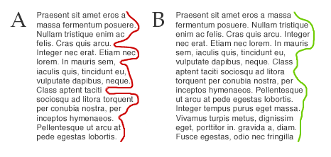
See Unjustified type. (Lines of type set with equal interword spacing, resulting in irregular line lengths. Also called ragged.)
RAM.
Abbreviation for random access memory, the area of a computer’s memory that temporarily stores applications and documents while they are being used.
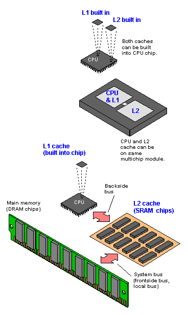
RAM cache.
An area of the computer’s memory set aside to hold information from a disk until it is needed again. It can be accessed much more quickly from a RAM cache than from a disk.
Raster display.
A raster image is divided into scan lines, each consisting of a series of dots from a thin section of the final image. This dot pattern corresponds exactly to a bit pattern in the computer memory.
Raster image file format (RIFF).
A file format for paint-style color graphics, developed by Letraset USA.
Raster image processor (RIP).
A device or program that translates an image or page into the actual pattern of dots received by a printing or display system.
Raster scan.
The generation of an image upon a cathode ray tube made by refreshing the display area line by line.
Recto.
In publication design, the right-hand page. Page one (and all odd-numbered pages) always appears on a recto. The left-hand page is called the verso.
Resolution.
The degree of detail and clarity of a display; usually specified in dots per inch (dpi). The higher the resolution, or the greater the number of dpi, the sharper the image.
Reverse leading.
A reduction in the amount of interline space, making it less than normal for the point size. For example, 12-point type set on an 11- point body size becomes reverse leading of 1 point.
Revival.
A little-used historic typeface previously unavailable in current font formats, now released for contemporary technology.
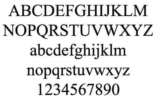
Roman.
Upright letterforms, as distinguished from italics. More specifically, letters in an alphabet style based on the upright serifed letterforms of Roman inscriptions.
Rule.
In handset metal type, a strip of metal that prints as a line. Generally, any line used as an element in typographic design, whether handset, photographic, digital, or hand-drawn.
Run-around.
Type that is set with a shortened line measure to fit around a photograph, drawing, or other visual element inserted into the running text.
Run in.
To set type without a paragraph indentation or other break. Also, to insert additional matter into the running text as part of an existing paragraph.
Running foot or running footer.
A line of text that duplicates a line of text from another page but positioned at or near the bottom of a page.
Running head.
Type at the head of sequential pages, providing a title or publication name.
Sans serif.
Typefaces without serifs.
Screen font.
A bitmapped version of an outline font that is used to represent the outline font on a computer screen.
Script.
Typefaces based on handwriting, usually having connecting strokes between the letters.
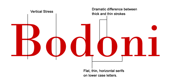
Serifs.
Small elements added to the ends of the main strokes of a letterform in serifed type styles.
Set width.
In metal type, the width of the body upon which a letter is cast. In phototype and digital type, the horizontal width of a letterform measured in units, including the normal space before and after the character. This interletter space can be increased or decreased to control the tightness or looseness of the fit.
Shoulder.
In metal type, the flat top of the type body that surrounds the raised printing surface of the letterform.
Side head.
A title or other heading material placed to the side of a type column.
Slab serifs.
Square or rectangular serifs that align horizontally and vertically to the baseline and are usually the same (or heavier) weight as the main strokes of the letterform.
Slug.
A line of metal type cast on a linecasting machine, such as the Linotype. Also, strips of metal spacing material in thicknesses of 6 points or more.
Small capitals.
A set of capital letters having the same height as the lowercase x-height, frequently used for cross-reference and abbreviations. Also called small caps and abbreviated “s.c.”
Solid.
Lines of type that are set without additional interline space. Also called set solid.
Sorts.
In metal type, material that is not part of a regular font, such as symbols, piece fractions, and spaces. Also, individual characters used to replace worn-out type in a font.
Stet.
A proofreader’s mark meaning that copy marked for correction should not be changed; rather, any instructions for changes should be ignored and the text should be left as originally set.
Straight matter.
Text material set in continuous columns with limited deviation from the basic typographic specifications.
Stress.
The gradual variation in the thickness of a curved character part or stroke; often used for any variation in the thickness of a character part or stroke.
Style sheets.
In several word-processing and page-layout programs, style sheets are special files containing formatting instructions for creating standardized documents.
Subscript.
A small character beneath (or adjacent to and slightly below) another character.
Superscript.
A small character above (or adjacent to and slightly above) another character.
Swash letters.
Letters ornamented with flourishes or flowing tails.


useful information on topics that plenty are interested on for this wonderful post.Admiring the time and effort you put into your b!..
ReplyDeleteΦΩΤΟΤΥΠΙΚΑ