Chapter 4 discusses typographic legibility.
The Chapter discusses that “the primary purpose of a letterform is to convey a recognizable
meaning in mind. Letterforms must be designed with clarity.” I find it interesting that the chapter
discusses that we recognize the shapes of letterforms and that these shapes
have developed because of the need for better communication. We might not
recognize a word, but we do recognize the shape of the letters.
This chapter also points out
interesting facts such as the top halves of letters are more recognizable than
bottom halves and right halves are more recognizable than left halves of a
letter. Another fact is that the letters fijlt are letters that can easily be
mistaken. I can relate to that because every time I read a sentence fast I
often make mistakes with words beginning with these letters.
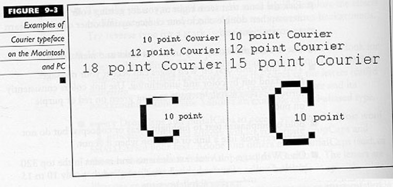
The chapter then goes on to talk
about capital and lowercase letters as well interletter and interword spacing. Texts
in all capital letters tend to decrease legibility because their shapes look
the same and they have similar size. They also take up more space then lowercase
letters. Lowercase letters take up less
space and the shapes of the letters are more distinct. I find this true because
when I read something in all caps I have trouble distinguishing words from each
other. Spacing is also a key factor in legibility.
Tight spacing and wide spacing are hard to read and disruptive. Whenever I read
words that have tight spacing between them, I feel like my vision is blurred
and words are on top of each other.
Color and legibility also are
discussed in this chapter. Black type on
a white background has been considered the most legible, but when choosing
colors one should look at the conditions that it is read. This includes the
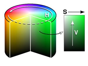
type of paper, the texture, size, and typeface. Hue, value and saturation
should also be considered.
Overall, I liked this chapter
because it gives the reader a visual example of what is considered to be legible
and what is not considered to be legible. This chapter really opened my eyes to
how much detail a designer has to consider when creating their work. I have
more appreciation for what designers have to do. The image below shows the many hues, saturation, and values of colors that designers can choose from in order to make colors of text and backgrounds legible.
No comments:
Post a Comment