Chapter 7, Case Studies in
Typographic Design, talks about typographic design problems as well as environmental typography, branding, web-site, and film titles.. The first design problem
that the chapter tackles is integrating type and image in poster design.
Jean-Benoit Levy does a great job tackling this problem. When Benoit Levy was a
student, his teacher Armin Hoffman told him something that helped him as a
designer. “Place type in the photograph rather than on the photograph.” I love
this quote because I think it sums up how to really integrate type in image in
a unified composition. We just don’t want type set on top we want it to become part of an image. The chapter shows several
examples of Benoit Levy’s works in which he integrates type and image.
Another interesting idea that the
chapter talks about is how graphic designers are transforming typographic
communication into kinetic sequences. I like how the chapter gives examples of
five movies, Superman, Altered States, Alien, True Lies, and Lethal Weapon 3,
and explains the special effects that happen to the titles of each movie. In
the movie Superman, bright blue names and the Superman emblem streak through
space like comets, stops then evaporates into deep space. The speed and power
of the film’s fantasy superhero are evoked. The effect is accomplished by
tracking rear-illuminated typography in front of an open camera lens. I think it’s
pretty cool how the chapter discusses how the films achieve effects of
typography in their titles.
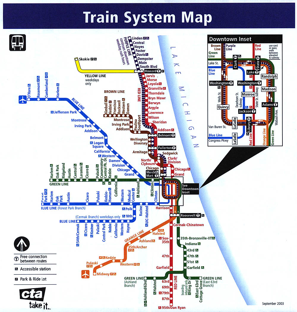
The chapter also talks about subway
maps and signage. I like how the chapter first discusses the background of the
Buenos Aires subway system and then shows us the first map and how it transformed
into what it is today in Buenos Aires. Research and
evaluation of the existing system stimulated the development of a rational and
functional graphic language that clearly communicates to the viewer. The viewer just wants to reach their destinations.The
signage of the subway is also another fascinating read. I think it’s
interesting that so much detail is put into signage such as the location, size
and typography. Below is a map of Chicago's train systems.
No comments:
Post a Comment